
UI/UX Design
sabbth,
sabbth, is an e-commerce platform for a developing business project. Its core raison d'être is that everyone needs rest--it's neither fulfilling nor right to be constantly on the go. sabbth, identifies what helps people breathe, heal, and revive, and crafts a unique recipe for rest. My role as a UI/UX designer was to bring the idea to life through visualization of its branding as well as creating a holistic online presence, with a focus on an effective checkout experience.
Role /
UI/UX Designer
Platform /
Mobile, Desktop, Tablet
Tools /
Sketch, Adobe Illustrator, Balsamiq
Year /
2017
The Approach
The Keys to Success
The first step before building anything was to identify the problems I need to solve from a user standpoint. In this case, we lacked immediate insight into specific user needs and thus made educated guesses based on market segmentation. We noted that this platform would encompass the following features:
-
E-commerce site with clothes and other products primarily for females
-
Target users will be utilizing both desktop and mobile platforms to browse through products and checkout for purchase
-
Must evoke a feeling of calmness, serenity and peace to communicate brand
-
At the very least, must have a user experience on par with that of endless competitors, if not more unique
We further identified the site's target demographic as females aged between 23 and 38, which called for some competitive analysis of sites that are frequented by this group. Competitive analysis included sites such as Anthropologie, Kinfolk, Formerly Yes, and Vermont. Based on the observations above and further analysis of competitor sites, we concluded that ours needed to be:
-
Photocentric: the featured photos would primarily determine the look and feel of the site, therefore the right choice of images were crucial to visualizing the website.
-
Minimalistic: the strongest examples that conveyed portions of our brand showed an appreciation for minimal aesthetics, clean lines, and plenty of white space.
-
Technologically savvy: some of the less impressive websites of competitive brands were unable to deliver the right customer experience due to clunky features in viewing, browsing or checking out. Ours would need to be pristine to stay afloat in the plethora of options for shoppers out there.
Though the project was a holistic branding & design for 3 platforms, my primary focus was on the purchasing & checkout process on desktop and mobile. Since online and mobile shopping would be the central method for sustaining the business, these processes needed to be as seamless and pleasant as possible. I started sketching and wireframing for the website with this goal in mind.

1. Different explorations of the landing page, and the final wireframe

2. A sitemap based on the final exploration of the landing page

3. Explorations of browsing product pages


Branding
Make it Pretty
Since the basic wireframing was done, it was time for the fun part. Branding the site meant deciding fonts, colors and distinct aesthetic qualities. I used Adobe Color CC, Google Fonts, Adobe Illustrator and good ol' pen and paper to explore the best look and feel for sabbth,.


I chose earthy, nude colors to convey calmness and serenity that were muted enough to act as a backdrop, as well as darker shades for text and primary features. I used a serif font for the logo--a nod to the classic styles we would feature--and a sans serif font to ensure readability and simplicity for smaller fonts.

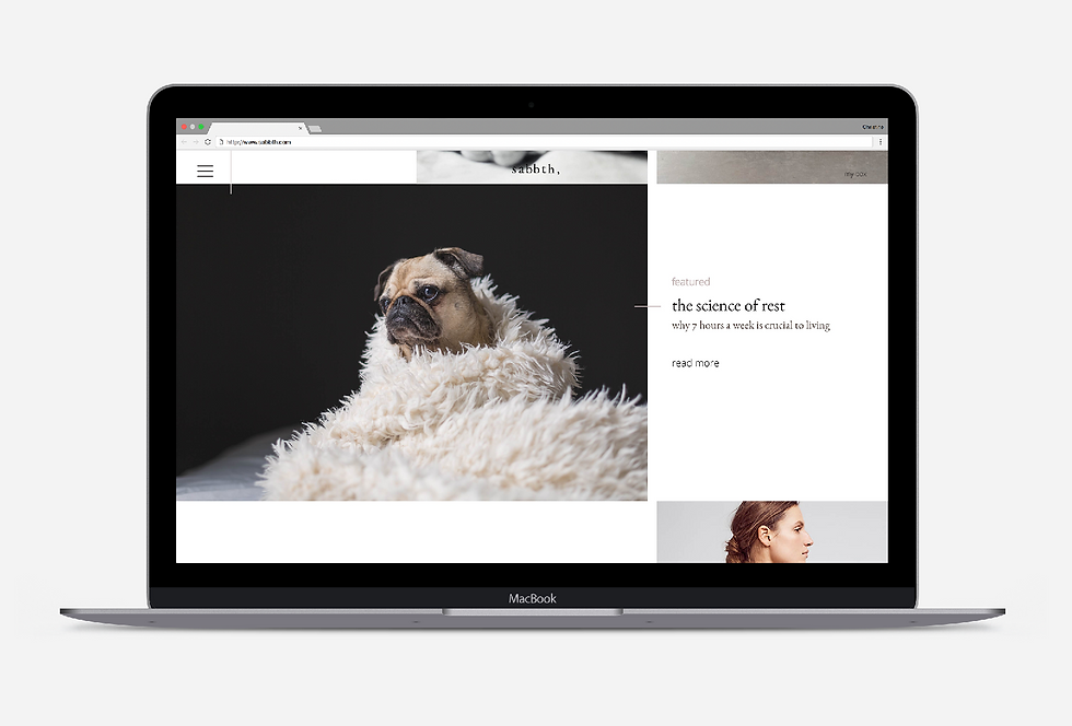
Screenshots of the final Homepage, and the About Us page in tablet form below.


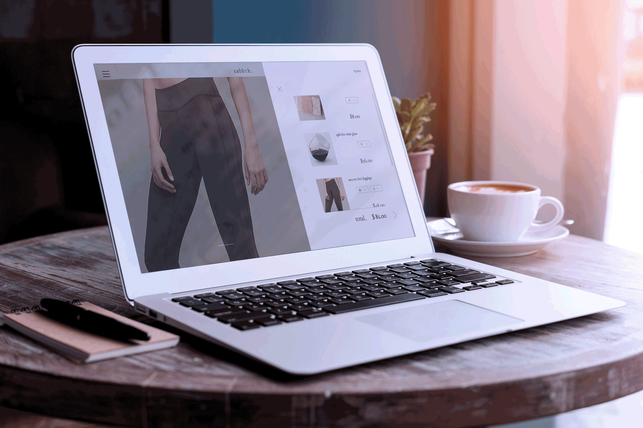
Checkout Process - Web
Make it Rain
The next, and most important part of this project was designing the UI for a seamless checkout experience. I scrutinized a number of different online shopping sites such as Everlane, Lou & Grey, A-dam Underwear, and Volta Footwear, as well as websites of traditional brick-and-mortar stores, including J Crew, Banana Republic, Zara, and H&M. The greatest pain points were in selecting different choices such as size, color and quantity. I identified the iOS UI picker as an easy way to select and not have to click back and forth between pages.
I designed the shopping cart as an overlay rather than a separate page so users can check their carts at any time without disrupting their shopping experience. Additionally, going from the shopping cart to checkout was depicted as a smooth, on-screen transition that does not require commitment to "finish shopping"; rather, the user is made aware that she can always return to the previous screen.


Shopping & Checkout - Mobile
From Big to Small
The mobile application held the same requirements as the website and would follow the same branding guidelines. Since most of the UI features were already determined, it was a matter of shrinking down both the visual elements and structural features to only what was required for a mobile user. I sketched the user flow and wireframed a prototype to clarify the process.


The mobile user flow was straightforward, and primarily concerned with thinking through how to use real estate in a clever way so as to not hide or show buttons unnecessarily.


Reflections
Simple Wins

My favorite part of designing the checkout process was visualizing credit card information so input is intuitive for the user.
From the standpoint of a UX designer, it seems obvious that the online shopping experience would be approached from the user's point of view. I had only heard of companies that could not upturn their entire website because a UX team had not been incorporated, or central to the design process. After benchmarking so many sites for this project, I came across numerous established companies that do not provide a slick customer experience online, most likely due to a lack of coordination among the marketing, design, engineering and customer satisfaction teams. It was refreshing to be able to pick and choose the best functioning UI features for online and mobile shopping and build the entire experience from scratch.