
Mobile App UI Design
Multimer
Multimer collects data from sensors that people wear as they move through the city, at all times of day. Their first biosensor, MindRider, specifically collects brainwave data that is categorized to show the areas of the city that are the most restorative, fascinating, stimulating, and powerful. DuKorp Corp (Multimer's parent company) requested a UI design of their data collection app, a high-resolution tool for complex location decisions.
Role /
UI Design
Platform /
Mobile
Tools /
Sketch, Balsamiq
Year /
2017
The Project
Make Our App Usable
I was asked to design a user interface so that research subjects would easily be able to interact with, and therefore more frequently use, their app. While functional, the application's original interface was still primitive in both information architecture and aesthetics (examples below). However, there was a fun design element already incorporated into the app: depending on the user’s emotional state, the background of the screen changed colors such as green to represent calm and red to indicate stressed. In addition to keeping the interactivity of this feature, the team had several specific requests:
-
Icons to indicate the different gears
-
Differentiation of states to represent whether the gear was enabled or disabled
-
Fuchsia and/or teal as primary or secondary colors
I began my design process based on these specifications.
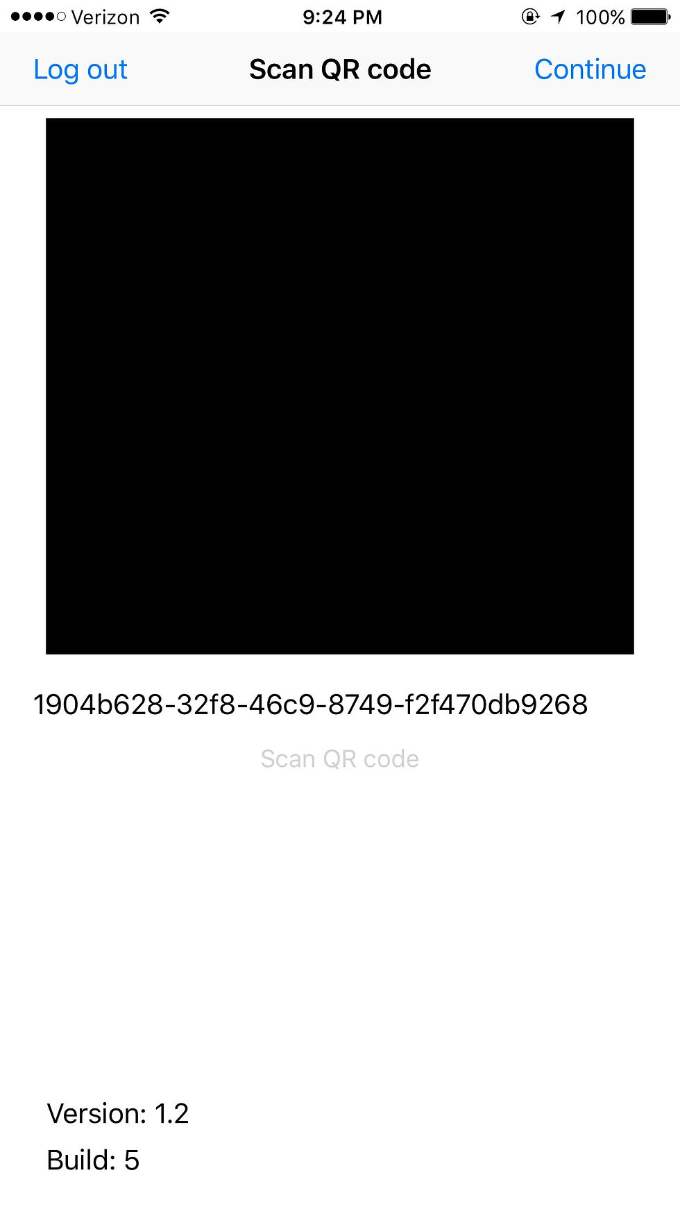


The original screens the team was using to collect data.
The Process
Getting it Right
1. Research & Analysis
Based loosely on UX Mastery’s UX process, I started the research and analysis step by conversing with Multimer’s team about the app's purpose and goals. Our sessions helped me understand the purpose of the app as well as its users, and any particular action points that needed attention.
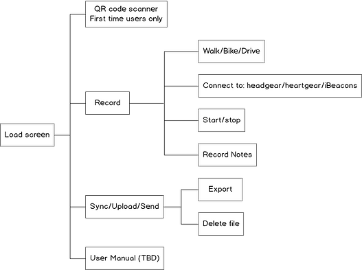
The user flow for the app was straightforward, with a focus on the Record and Sync screens.
2. Design
I wireframed the user flow to have a complete understanding of the process, from scanning the QR code to connecting the devices, recording a session, completing a survey, and exporting data. The team and I went back and forth a couple times to clarify how it would be best to show that the devices were connected--an on/off switch, connection signals, UI pickers, etc. For the first high-fidelity designs, we ultimately went with app-like buttons, a nod to the iOS features we were using for the overall design.
In the process of wireframing, the diagnostics data--or newly named "My Stats" screen was moved to a separate page that would visualize the user's state with more specific information. It was important to distinguish the Record page as a controllable interface, and have the My Stats screen function as a display for information about the user.

For this particular project, I used Balsamiq exclusively for all wireframing. The simplicity of the flow allowed for immediate visualization without sketching on paper.
3. Evaluate
After the first version went live, Multimer ran testing sessions to receive feedback from several users. I received the following comments from participants:
-
When using the app, there was no way to distinguish whether the specific gear were available to connect, as opposed to already connected to the user's phone.
-
The color grey for an unselected Record or Data tab at the bottom of the screen was misleading as grey was being associated with being disabled, and therefore inactive.
-
The Add Note button was static and did not encourage the user to record notes actively throughout a journey.

The first high-fidelity design of the record screen featured only the first and third states of being disabled and connected. Users needed 3 states: disabled, enabled (gear available to connect), and connected (ready to start journey).
For the first and second iterations, I made the following changes to address user's pain points (mockups below):
-
Three different states were created to signal whether their gear was disabled/unable to connect, enabled but not connected to the phone, and connected and ready to record.
-
The unselected Record and Data tab colors were changed from a light grey to a black to indicate its clickability.
-
The Add Note button was separated from the list and put to the side of the Start/Stop button in order to draw more attention from users.


4. Launch
Rather than preparing for one hard launch, the team at Multimer is continuing to update its application and receive feedback on a continual basis. I commend the team's user-centric approach, as it's in line with Steve Krug's recommendation to always be in communication with users and release soft launches--even if it's embarrassing to show the current product to users. As predicted, testing sessions brought up disconnects in features that I had not previously considered, but these were easy to solve at that point as we were still improving the UI design.
Conclusion
Lessons Learned
The most important observation I took away during this project was how strongly user preferences--real time feedback on whether a design element was working or not--and my own stylistic decisions and assumptions as a designer/artist could clash. As a UXer, my first priority is to create intuitive interfaces that are effortless to understand. As a designer, I wanted to stick to colors and layouts that were familiar or previously successful (e.g. the Record/Data tab UI). It was rewarding, and of course my job, to find an aesthetically correct solution that did not confuse the user, even when the two criteria seemed to oppose each other at first. Since practice makes perfect, I look forward to solving more problems like these in the future.
