
PicFic is an online publishing startup born out of a writer’s frustration with being unable to reach her audience in a way that benefits both the reader and the writer. Traditional publishing is stacked against writers to the point that 50% of writers report earning less than $1,000 a year. PicFic approached this problem by creating a new product that meshes together the best parts of reading, fandom, and an online community.
Role /
Product Designer
Devices /
Desktop, Mobile
Tools /
Sketch, Invision, Balsamiq, Adobe Illustrator & Photoshop
Year /
2017
PicFic
Product Design
Introduction
Read Into It
This case study is a snapshot of the progress made from June through August of 2017, although the initial idea and some prototyping started in April. Our team comprised of a writer & master pitcher, an MBA & artist, and myself. I was brought on early in the process to develop PicFic’s brand, product, and strategy up to its beta launch. We tackled a three-pronged market of writers, readers and artists—first and foremost by targeting the writer’s pain point, and then approaching it from the reader’s (or user’s) point of view.

The Strategy
Pivot, Pivot, PIVOT!
Specifying the minimum viable product (MVP) for our launch date in three months was the central problem and our most tested solution. We conducted market research, created user personas, and interviewed those who would be using our platform--writers, bookworms and illustrators. Our initial vision of recruiting traditionally published writers with an established fan base fell through when they told us that, though excited, it would take at least a year for them to provide original content. In order to fill that gap, we spent most of our time in meetings brainstorming different beta launch strategies based on what we had learned from UX research, some of which I wireframed and designed low-fidelity mockups for.


Coggle is an easy, free mind mapping tool to visualize meeting notes and/or brainstorm on your own.

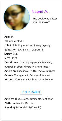 Naomi |  Chris |  Lindsay |
|---|---|---|
 Jenny |
From sticky notes to personas: I led group exercises that helped us hone down our target users.

All content posted in community
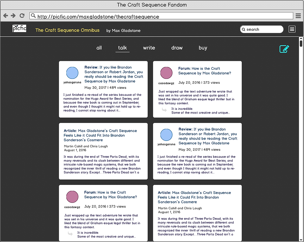
Forums, Articles, Discussions

Fanart

Fanfiction


I used Balsamiq as a wireframing tool to visualize the UI for ideas that came up during mindmapping sessions.

Some of the directions we pursued went all the way up to medium fidelity prototypes.
After many mind mapping sessions, mentor meetings (thank you, MIT NYC Startup Studio!), and multiple testing sessions and user interviews with our initial prototype, we were on the verge of despair as a three-pronged market seemed impossible to penetrate. The chicken-and-egg problem presented itself over and over again. It was our first mock board meeting as part of our accelerator program that pointed us in the right direction (summed up, “Just pick one and try it out, you’re trying to accomplish too much right now”). Going back to the insights we had gathered from surveys and interviews, we pared down our grand plans for the beta to the bare bones, had a collective epiphany as to what Minimum Viable Product truly means, and continually reminded each other that we are not trying to do everything here.

Survey Results

Survey Results
Our second of two Invision prototypes brought back some positive results (actual survey responses shown above). Below this are samples of the pages we tested.

Design & Production
A Rough Draft for Everything
Once we determined the main features for our MVP, I put on my designer hat and went to work. Thanks to many earlier explorations of different features on the site with a unified brand, this part was more about walking through the logical processes and less about coming up with new, creative designs. Working with our frontend and backend developers, I designed the user flow from reading, interacting with fanart, signing in, and uploading stories, to other small details that non-designers never think about. Being the sole designer, it was challenging to keep up with the pace and workload while trying to create pixel-perfect designs. I took satisfaction in knowing that however dinky our beta may seem later, we launched an MVP and received feedback from our users to improve it.
The Launch
Ready, Set, Publish
The beta is a good balance of user interactivity and gamification without confusing the user as to what our main features are. We focused on serialization, visual interactivity (being able to upload fan art), and participation from writers, who can submit their own stories for publishing on our platform. One requirement was to make the site mobile-friendly so as to avoid alienating the majority of our target market, even though the uploading features are only available on desktop. The goal is to reach 500 signups with our beta launch, receive feedback on the features, and keep iterating.
 Landing Page |  Profile |  Preview |
|---|---|---|
 Tips - for animated instruction |  Page 1_Menu |  End of Chapter |
High-fidelity mocks of our MVP website, from landing page to reading
 Highlight text |  Upload |  Loading |
|---|---|---|
 Preview upload |  Submission complete |
High-fidelity mocks of the user flow for uploading fanart while reading a picfic


Must go back to the drawing board when going through a user flow.

A few of the many screens needed for a holistic login process.
Our sign in/sign up process was modeled after Medium and Spotify's login methods.

