
Click & Collect Platform Redesign
Hannaford To Go
Hannaford Supermarkets is a grocery brand operating in New England and New York, acquired by parent company Ahold Delhaize as part of a merger in 2017. Known and loved by its customers for the role it plays in strengthening communities and catering to local tastes, it was also the first of AD's brands to introduce Click & Collect to its customers. Its unprecedented success called for a much-needed redesign of its site. I was part of a team of 5 designers recreating Hannaford's online experience.
Role /
Product Designer
Platform /
Mobile, Tablet, Desktop
Tools /
Sketch, Invision
Year /
2018
Hannaford's ad spot for its new Click & Collect experience.
Understanding our users
A House Divided
Hannaford's website began, as most brick & mortar grocery sites do, as a platform focused on communicating sales to customers. Users' main needs were to check for deals and coupons before their trips to the store. Then, the brand introduced Click & Collect online shopping to the experience.
This introduced new phases in the customer journey encompassing entirely different user needs, and as online revenue soared, demand grew for product-focused, cart-driven content. So, we started from the beginning with an omnichannel customer journey map.
The holistic shopper's journey we created at the start of the project, based on internal research from Ahold Delhaize USA customers as well as general grocery shopper behavior, now guides us through every consumer-facing project. We know that while pain points and opportunities in each step are specific to the channel and/or platform, this overall journey does not change.

The Omnichannel Shopper's Customer Journey
The overarching question that we kept returning to during the redesign was, how can we cater to the e-commerce shopper's needs without alienating our brick & mortar customers? The UX dilemmas arising from this fundamental question were complex and challenging to say the least, because functionalities that in-store customers were looking for were sometimes very different from the ones e-commerce shoppers expected as they added products to their cart and checked out. While not comprehensive of the scope of the project, the following table breaks down sections where the features could vary significantly depending on whether we prioritized the e-commerce or brick & mortar customer's needs:
This case study focuses specifically on the Shopping List and Add to List features. This was one of the more interesting UX challenges as opposed to other sections like Search or Cart that are present on every type of e-commerce website. We approached it as if it were a completely new feature and focused first on clearly defining the who/what/why, even before doing heuristics of the current experience or exploring the competitor landscape. We started by separating our users by the two types and asked ourselves how their mental models of lists were different from each other.

E-commerce Customers' Online Journey

Brick & Mortar Customers' Online Journey
As visualized above, e-commerce shoppers spend most of their shopping journey in the digital realm, whereas brick & mortar customers come online only to plan. In addition to checking for deals in the weekly ad and clipping coupons, e-commerce customers have access to more features to make their shopping easier. For Shopping List specifically, it was likely that sections such as Past Purchases or Order History made it easier for returning customers to to fill their carts than Shopping List, where the user has to manually build and constantly manage specific lists.


These sections are tailored specifically for the e-commerce customer's shopping experience, so we expected users would look here rather than engage with shopping lists when adding items to their cart.
We gleaned another important insight for e-commerce shoppers from the Nielsen Norman Group's Ecommerce User Experience Report: online users often used their carts as "staging areas" or lists while they were browsing online. This fit in well with our knowledge surrounding cart behavior--it took minimal effort/buy-in to add items to their carts, but it was during the "Done for Now" stage of the journey that customers would decide which items to keep before proceeding to checkout. From this, we hypothesized that since click & collect customers already have a feature (cart) that they use as a list, the Add to List capability would not be as important to them.
For the e-commerce shoppers that did utilize lists, we explored several use cases. The primary one supported by external research was that they could want to create groupings of products that were recurring orders (weekly, monthly, holiday, upcoming events, etc). (Data on overlap between Hannaford click & collect customers and those who used Shopping List was unavailable to us.) Another table stakes functionality for these users would be the ability to add products to their cart, individually or in bulk.
As for brick & mortar customers, we already knew that lists were an important part of their online experience. Pre-click & collect, these users were accustomed to interacting with Shopping List to make in-store lists and take other notes for what to do while at the store (go to bank, get flowers, cash check, etc). The more they could do with their lists, the happier they were, which was why the business ask included keeping legacy functionality such as adding write-in items or adding recipe ingredients to list, even if they did not map to specific products.
Thus we were able to identify our primary users for Shopping List as the in-store shopper who came online to plan ahead for their trip. They were the ones who might disregard the cart as irrelevant to them but still be looking for ways to easily add items to lists. They would also want to be able to check them off while they were shopping in store. The secondary audience was the e-commerce shoppers who might want to keep multiple groupings of products so they could easily add them to cart when checking out. Identifying the users and their primary needs helped guide what to look for while conducting competitive analysis and heuristics of the current shopping list experience.
Heuristics & Competitive Analysis
Lists on Lists on Lists
We were lucky to have access to some high-level data for shopping list usage on hannaford.com. An average of 3% of customers held active shopping lists online, 'active' meaning they had one or more lists with added products. Of those 3% of users, about 10% had ten or more active lists. We learned from the Hannaford insights team that avid users of the feature were already vocalizing several pain points in the experience. This documentation coupled with our own heuristics uncovered several important insights:
-
When removing items or adding items to cart in bulk, the interaction of selecting radio buttons for each product was confusing. Customers were often unaware that they had to click "save changes" to apply their preferences.
-
There was no way to preview a list if there was more than one at a time.
-
The "proceed to cart" CTA caused confusion among users.
-
Because non-UPC items (products that are not mapped to SKUs) could also be added to shopping lists via Recipes, customers needed clearer messaging that those items would not be added to cart when adding in bulk.
-
In general, there were many functionalities in the shopping list that were confusing for users.


A window into the legacy designs we were working with--the first is a view of the shopping list, and the second is the interaction for adding items to a list.
We also conducted an analysis of our competitors to compare Hannaford's current shopping list features with those in the industry landscape. We focused on documenting common or best practices of other grocery sites' online list features. As we often do during the research phase, my team member and I spent more time scouring the Internet and recording our findings in Google Sheets than designing in Sketch or Invision.

I teamed up with another designer to record about 40 capabilities in lists across our main competitors, which helped us prioritize features for our designs.
Our findings helped us separate the information and functionality that were table stakes or common features, from those that were "nice-to-haves" but not a priority. The research netted out to the following, with those in the last category documented as strategic vision, but out of scope for the current project:
Table stakes
-
Display all product attributes (image, description, price, overline, quantity, etc)
-
Display number of items in list
-
Ability to remove item
-
Ability to add item to cart
-
Ability to select multiple items to take action (remove, add to cart)
Common features
-
Ability to add to multiple lists
-
Ability to preview and manage at the list-level (removing, editing name, etc)
-
Ability to add note to an item
-
Ability to add note to a list
-
Ability to add write-in (non-UPC) items
-
Ability to adjust quantity
-
Ability to display if items are out of stock
Nice-to-haves
-
Display total price of items in list
-
Ability to add recipe ingredients to list
-
Ability to search an item and display results/suggestions within list
Wireframes & Mock-ups
The Fun Part

The findings above applied to 3 sections/components in the redesign: Shopping List, Product Tiles, and the Product Detail Page (left). Users needed to be able to easily add products to their lists. As this was part of the business requirements for the project, we had already designed for this experience and placed the Add to List CTA prominently below the Add to Cart button.
In addition to the ability to add at the tile level, the customer could also create a new list and/or select multiple lists to add the product to. The flow below shows a customer adding blueberries to 2 different shopping lists through one interaction on the product tile (this works the same on the product detail page).

Final UI specs for the product tile/add to list interaction.
Designing the Shopping List section was the fun part after doing most of the heavy lifting around prioritizing functionality. We worked in a cadence of wireframes, design comps, and revisions with a review in between each design sprint. During the wireframe cycle we focused on specific UX interactions--how the user would access lists, what functionalities would be available on the landing page versus the list, how the user would select items to remove or add them to cart, and more. In terms of the view of horizontal product tiles within the list, we synced with the designers who were working on the cart. The tiles looked the same in both sections except for added capability in Shopping List to check items and add them to cart.


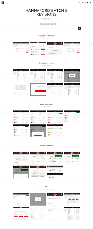
For a walkthrough of these designs in more detail, reach out to me directly.

Testing
Validating Our Assumptions


We implemented a fixed header that would maintain upon scroll, where users could expand List Options to remove or add their items to cart.
One hotly debated topic while designing the shopping list page was whether or not we should extract one or all of the actions under "List Options" so they weren't hidden under a dropdown, especially the ability to select all items. It was unclear whether the user would know how to check all items at once or take any action in bulk after checking multiple items. Ultimately we decided to keep all options hidden under a dropdown for the sake of simplicity in UI, but made a point to test this during a comprehensive usability testing session.
Lo and behold, this task did score lower than others on desktop, so it was flagged as a priority for iteration. Our explorations include introducing a checkbox that allow users to Select All, or bringing out a separate CTA for Select All (both previously explored but vetoed options). This was a lesson for all of us in the importance of scheduling time and resources for guerrilla testing into the design process instead of waiting for a formal session to validate our assumptions.


