
Mobile App UI/UX Design
Deli Order Ahead
Ahold Delhaize is a multinational grocery conglomerate with over 6,600 stores across in the Northeast. In 2017, Stop & Shop, Giant Food, Giant, and Martin's introduced deli kiosks at their brick & mortar stores, through which customers could skip waiting in line to place their orders. The kiosks were so successful that the brands requested the development of Deli Order Ahead, a feature that allows customers order fresh deli ahead of time on their phones. We completed design and development in 2018 and customer rollout began in Q1 of 2019. Since its launch, revenue has risen organically by 4,600%.
Role /
Lead UX Designer
Platform /
Mobile App
Tools /
Sketch, Invision, Flinto
Duration /
8 months
562
stores
2,630+
orders/mo
$35k
revenue/mo

Process & Overview
The North Star Approach

The product development process that we follow is typical of any UX team, and while the first four steps (research, wireframing, user testing and UI design) are not strictly linear, our priorities differ at each point in the cycle. Below is the same process, documented in a visual timeline for this project. Over the first few months, myself and another designer on the team met and interviewed customers, presented to key stakeholders, and collaborated with product owners and development teams to design the end-to-end experience.

The project officially kicked off with a UX-led workshop involving business stakeholders, POs, engineers, and store operations managers to align on the goals and scope of the feature. Our team presented the research we had conducted up to that point from our store visits, personas and marketing research insights. We asked questions about their goals and vision for the app and also asked for input from development on technical feasibility and scope. Armed with this context, the group split up into smaller teams to create more specific customer journeys and empathy maps.


One of the goals of this workshop was to build stakeholder buy-in and trust, which succeeded because we established ourselves as all on same team, starting with empathy for the customer.
As many product designers and product owners would aptly predict, the north star visions laid out by our stakeholders (ranging from AI-driven voice assistants to automatic ordering based on family calendars) did not make the cut. However, through the process outlined above, we were able to achieve the following wins:
-
Customers can order any in-stock item by weight/cut (all legacy kiosk features) through same-day scheduling via mobile app.
-
Customers are able to track the progress of their order from "Order Placed" to "Preparing Order" to "Ready for Pick up".
-
Customers can view recent orders they placed through the app, organized by date, and use this history to add previous items with specific cuts/weights to their current order.
-
Customers can search for specific items and see a list of popular deli items when they highlight the search field.
Research & Analysis
Make It Count
The first phase is meant to answer a critical question: why are we building this product and what problems are we trying to solve? Additionally, the insights we uncover from this phase allow us do the following:
-
Break down the journey from the customer's perspective, effectively humanizing those we are building the product for and creating personas we can always reference
-
Identify pain points and areas of improvement in the experience, and map them back to business opportunities
-
Document user expectations for similar experiences and allow this to inform our UX architecture--because Jakob's Law
-
Be transparent when socializing our goals and designs across the product team and to stakeholders so we have hard research backing our arguments and recommendations.
For this project specifically, we used the following methods to fully understand the customer journey and the pain points we were aiming to solve:
-
Heuristics analysis (current kiosk)
-
User interviews
-
Field observations (store visits)
-
Persona building & writing user stories
-
Competitive analysis


Above are some slides that condense the output of our research. These were created for a diverse audience, so we kept the UX and technical lingo to a minimum.
Some designers may scoff at the thought of "dumbing down" research to provide rationale to external teams, but synthesizing and socializing the insights we uncover to be accessible to others is critical. It lets others quickly connect the dots on which features are core to solving the pain points we've identified. It also is a fundamental piece of being part of a larger organization, and helps eliminate unnecessary friction or competing resources between teams when ideas come up that may seem cool or worth exploration, but slate out as "nice-to-haves" rather than a solution when mapping back to the original pain points.
Wireframing & User Testing
Into The Weeds
One of the guardrails set from the beginning of this project was that the order ahead capability would be integrated into an existing mobile app that had other primary functions, such as clipping coupons and viewing a weekly ad. The brands had just launched new mobile apps in React Native with a UX architecture that was catered to these features, but they did not necessarily adhere to iOS or Material guidelines. The app's UX architecture--what constituted a modal versus a push page? How many levels of tabs could exist within a page?--needed to be more fully fleshed out so we could build upon consistent navigational patterns and component behavior.

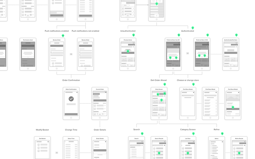
Without an established design architecture to build from, we started by creating a high-level view of all the sections in this feature and their relationships to understand how to design navigation patterns.
Since the designers who created the new app were still part of our team and ours is a centralized one, we were able to define a mutual framework for the app and from there, create low-fidelity wireframes. At the same time, we were mapping sections and screens to each step of the customer journey (browsing, searching, adding, checking out, modifying order, picking up order, and reordering). As these flows were being completed, we conducted guerrilla usability testing with actual store customers. Competitive analysis continued through this phase as we came across section-specific questions such as what to place on the home screen or whether we should introduce horizontal scrolling.

I always find visual highlighting to be helpful when doing a sweep across multiple competitors for certain features or UI patterns.
Our guerrilla testing was quick & dirty. We created 3 clickable prototypes in grayscale to keep customers' focus away from any stylistic or branding elements, and asked them to complete tasks such as searching for an item, adding an item to cart, and checking out. We caught small usability issues and also collected important qualitative feedback about their expectations for comparable apps. An often forgotten benefit of conducting guerrilla testing is getting that human connection with customers--being in their setting where they shop for groceries helped remind us once again why we are building this product and the pain points we are aiming to solve.

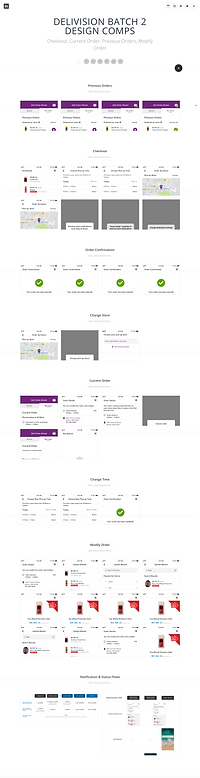
Final screens laid out for one of our prototypes. We use Invision for most of our collaboration needs.

UI Design & Implementation
Get It Out The Door
One of the challenges we are working through as an organization today is answering the question, who owns product? At this point in time, our team was housed under IT as a service organization so we had cycles of feedback with our brands--or clients--before getting to development. The way this has been changing is a topic for another day, but at this point our team functioned as a design service for the brands. That meant we grouped our designs into "batches" and scheduled wireframe and UI reviews for stakeholder presentation and approval before handing off designs for implementation. We used Invision boards to present flows and UI to brand stakeholders.


We tried several tools for presenting effectively to clients, and found that Invision boards work best in terms of sharing and annotating.
Each review had engineering present, which served 2 purposes for product: first, they were able to provide concrete rationale for certain technical limitations, and second, they were able to hear the asks being made and therefore understand the larger vision that was driving the product. Clearly defined deadlines for feedback helped us finish each batch on time to hand off assets for implementation. Because developers had been involved in the design process, there was little onboarding and/or knowledge transfer needed before development could begin. Another designer attended day-to-day stand ups to answer questions and complete UX reviews in JIRA. Below is a prototype I created in Flinto to show interactions such as horizontal scrolling that are not available through Invision.

Results & Reflection
Revenue, Conversion and More
Deli Order Ahead rolled out to customers of 562 stores in Q1 of January 2019. As of April, the number of mobile orders placed has increased organically from 56 to 2,630 per month, and revenue has been on a steady rise starting from $735 and reaching $35,000. This nets out to an overall 1% growth in total deli orders so far--a promising number considering there are about 1 million orders placed per month. In terms of conversion, after an initial surge, the number of new users has remained consistent at about 100 a month, which means overall customer retention is high.

Every projects has its learnings. Most of the challenges we faced have been documented in this case study, but one thing I would do differently if I were to repeat this project is prioritize A/B testing post-launch. There were several minute design decisions made without the data we needed to know if it was the "better" direction. While following best practices is always a good thing, we would have benefited hugely from being able to test the options and select the one that led to more product adds or customer conversions. Still, a 4,600+% and growing increase in revenue is an incredible outcome. Kudos!
